
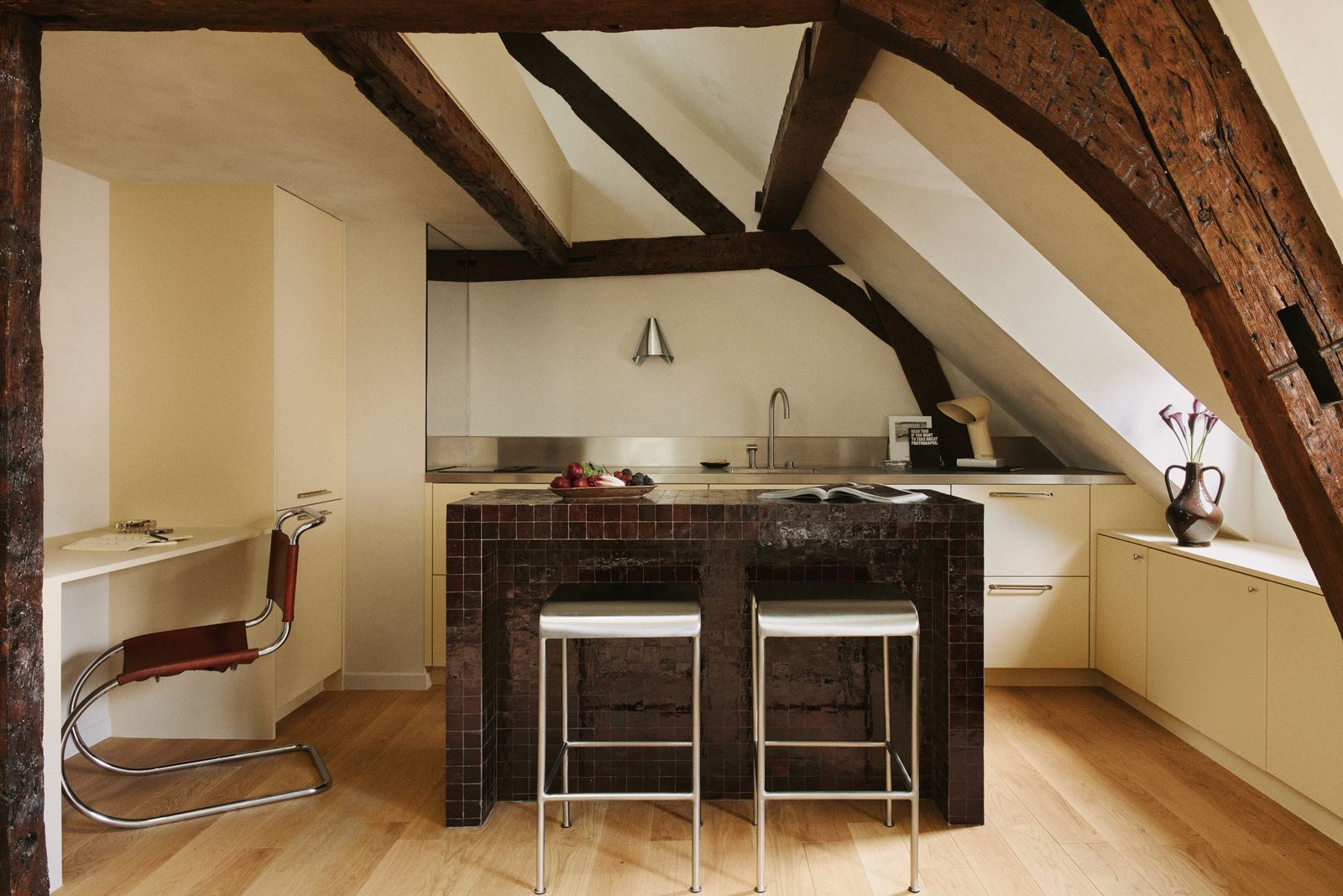
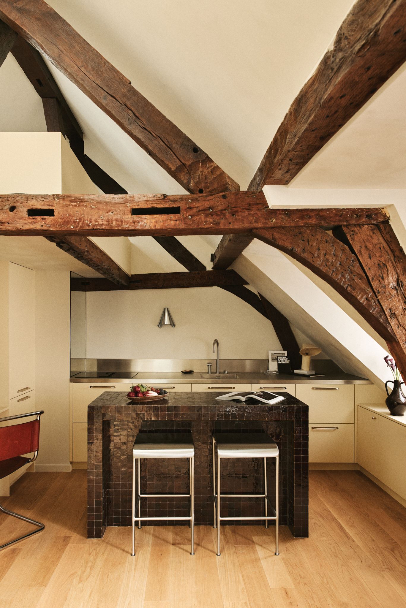
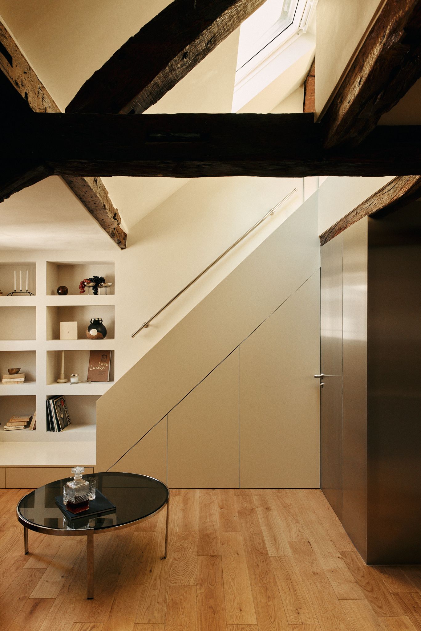
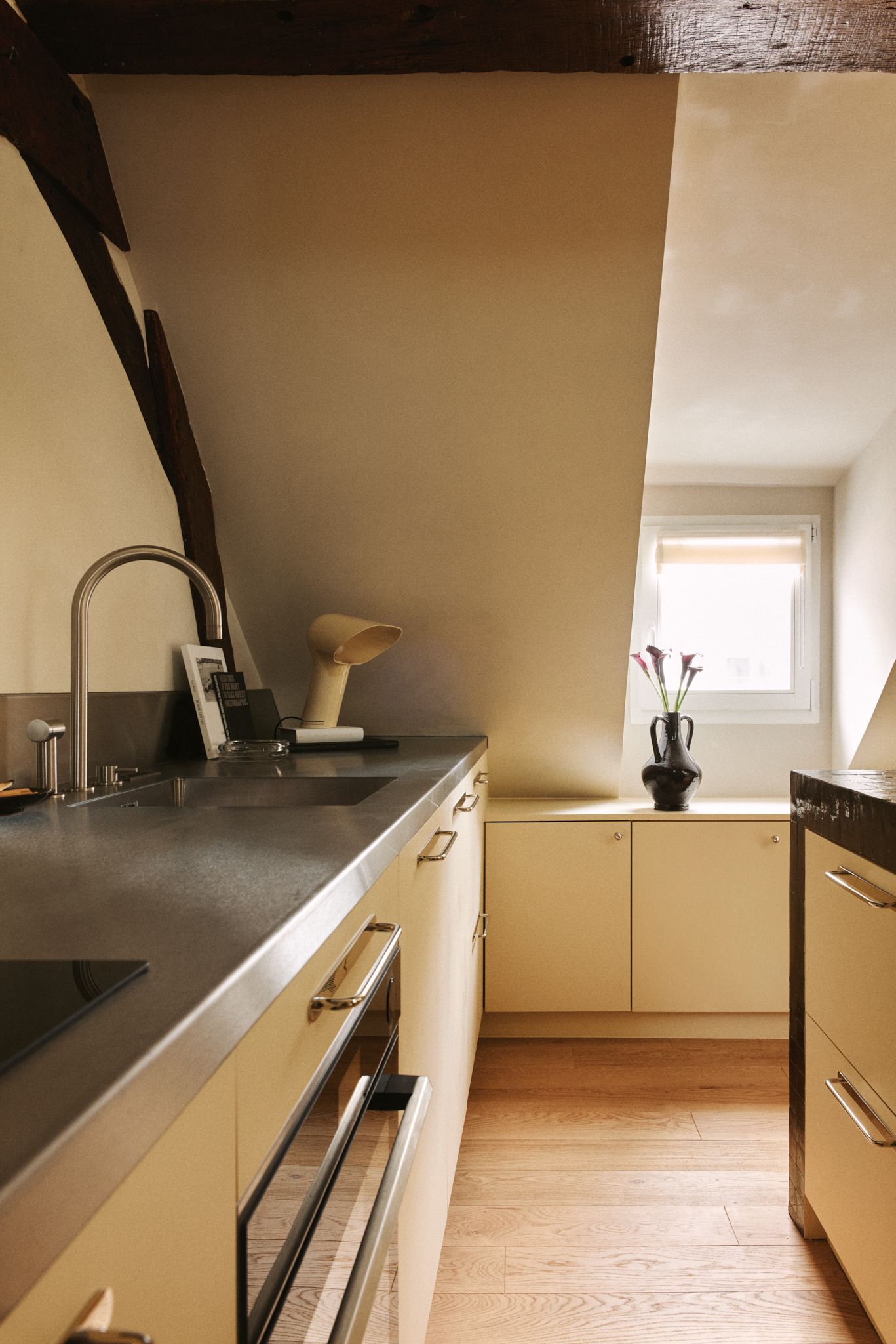
Made up of several former maids’ rooms with strange proportions, this 323-square-foot Paris apartment that Atelier Opale recently redesigned started off confused and charmless. “When we begin a project, we like to draw inspiration from existing elements,” explain Alexandra Gérard and Alice Lefebvre, founders of the design studio. “Here, however, there was nothing interesting to work with except the beams and the skylights. So we built our design around those two features.” The team started by reorganizing the apartment’s layout—the building was built around 1900, and needed a serious facelift. After they created the perfect interior canvas, the duo crafted a soft “cream-colored envelope” using lime paint, accented by the bold graphic beams.
Compare and contrast
“Our idea was to create a contrast between the apartment’s highly graphic elements,” the architects explain. The kitchen island became an important feature, as did the bathroom, which the duo tucked behind a large stainless-steel cube. They also played with textures, from warm lime plaster to beige lacquer, shiny tiles, and matte plastic elements. The owner, who is an artist, was eager to live in an inspiring space that is “a little rock ‘n’ roll, just like she is.” Still, it had to be functional enough to accommodate her graphic design, collage, and painting activities—hence the incorporation of a small desk and a large work surface in the kitchen, where she can both cook and create her art.
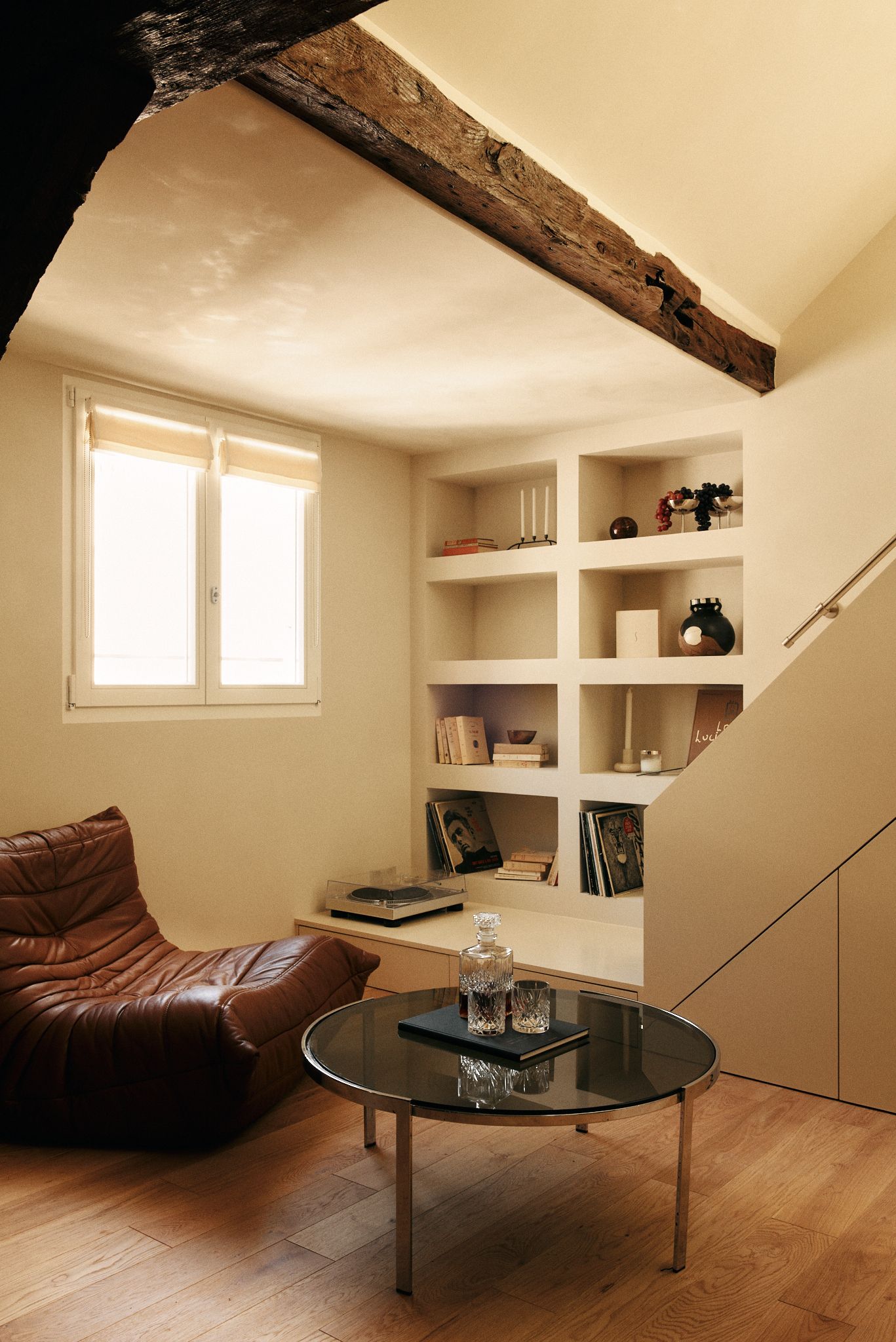
The storage challenge
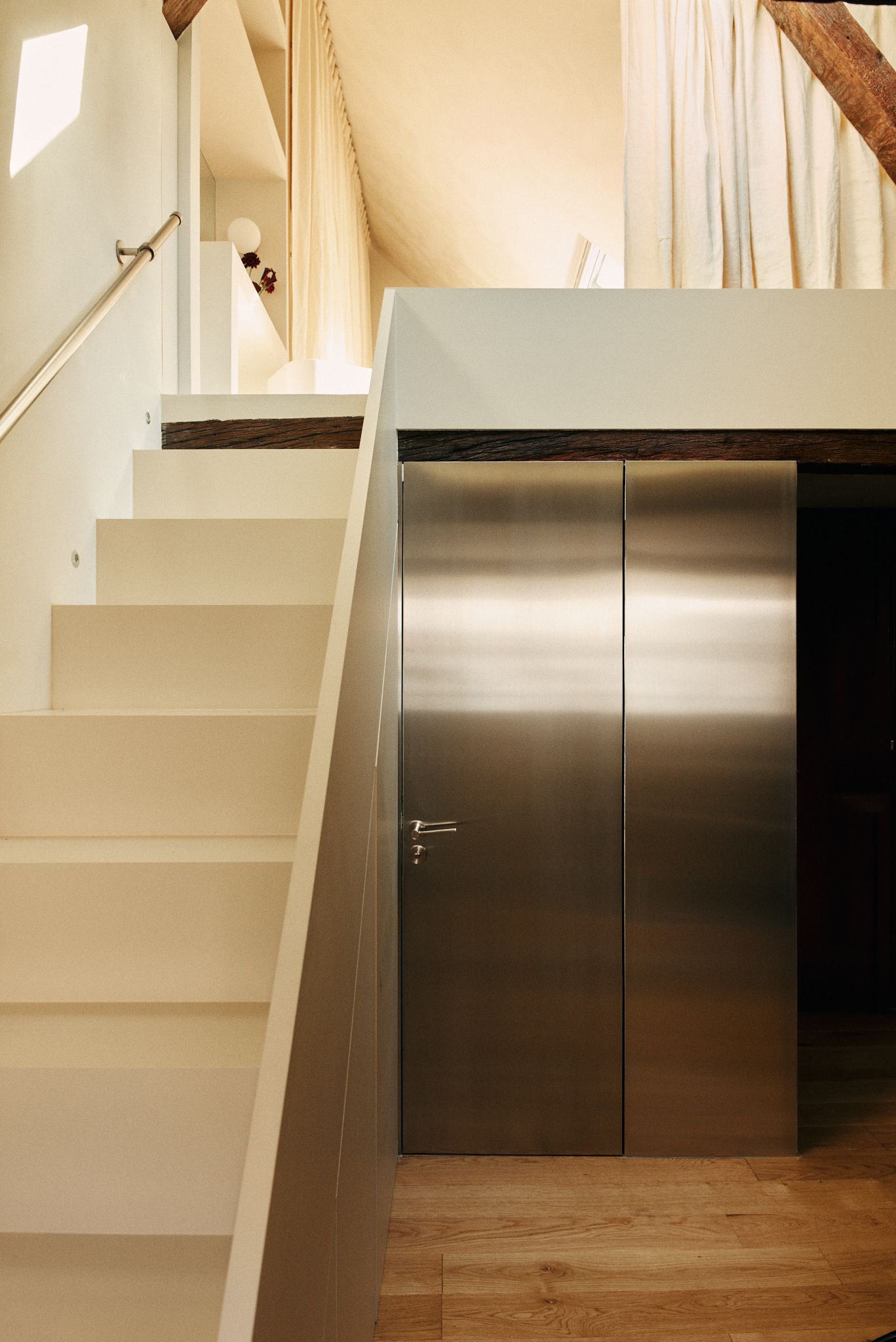
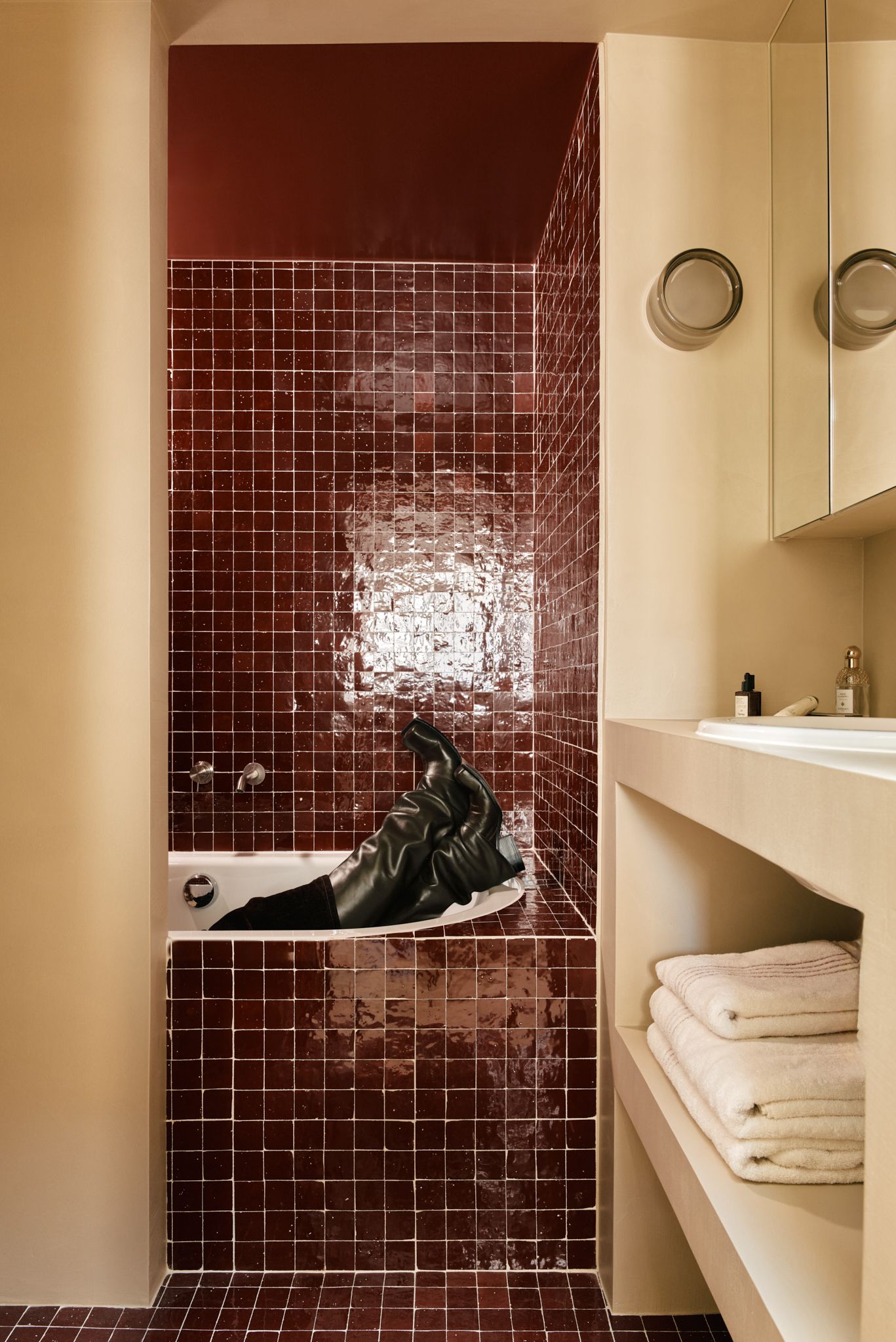
“The apartment’s shape was irregular, so we wanted our intervention to be very direct and straightforward, to not add to the existing complexity,” the designers say. Curves, for example, did not lend themselves to the space at all. To further avoid visual overload, custom bookcases were built directly into the walls. Not only do they give the impression that they had always been part of the space, they helped to optimize storage—those who’ve lived in smaller spaces know this is a crucial pain point. “We had lots of nooks and crannies under the sloping ceiling, and we made use of every one of them,” explain the interior designers, who also incorporated a laundry room under the stairs, and a compact-yet-stylish bathroom under the mansard roof.
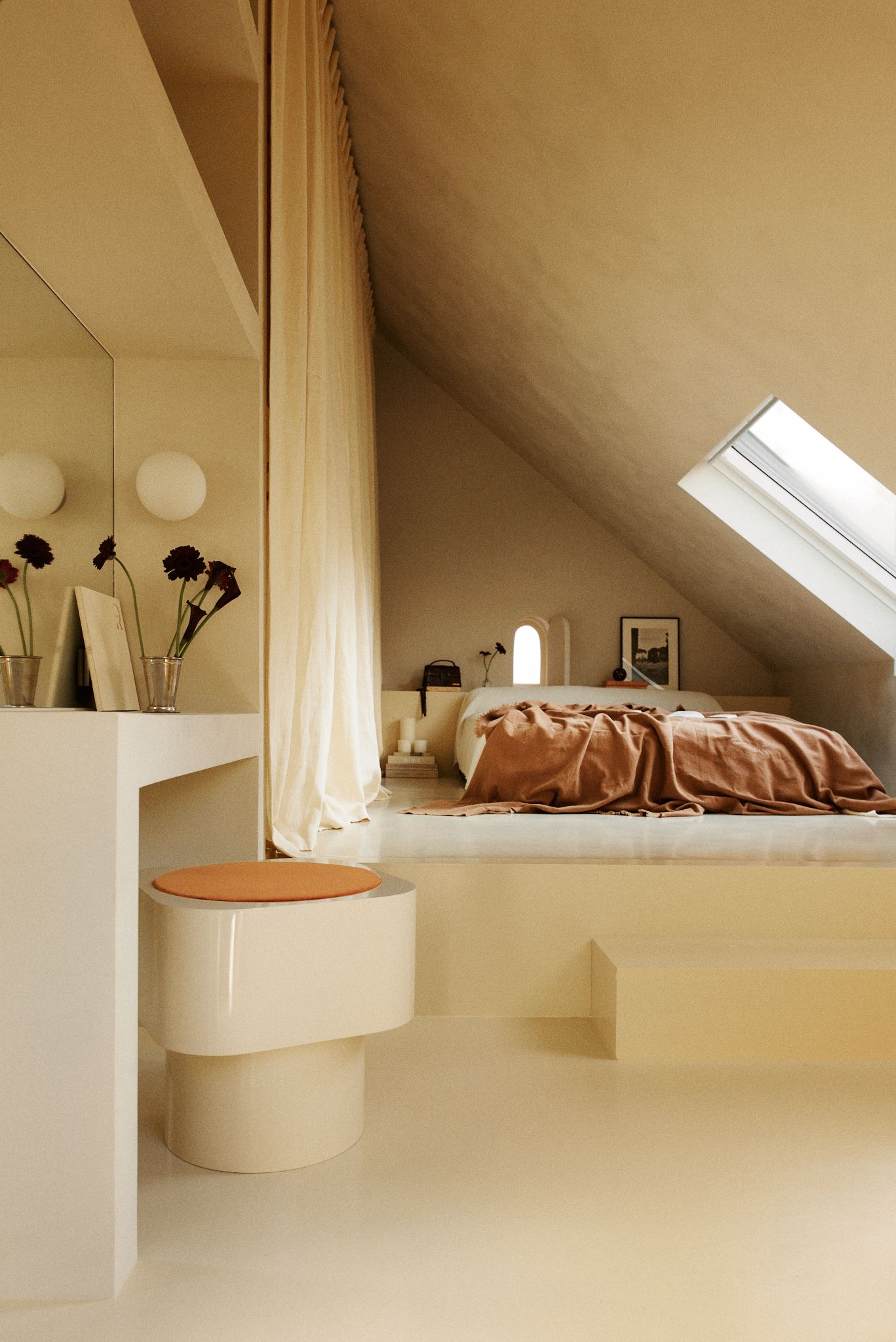
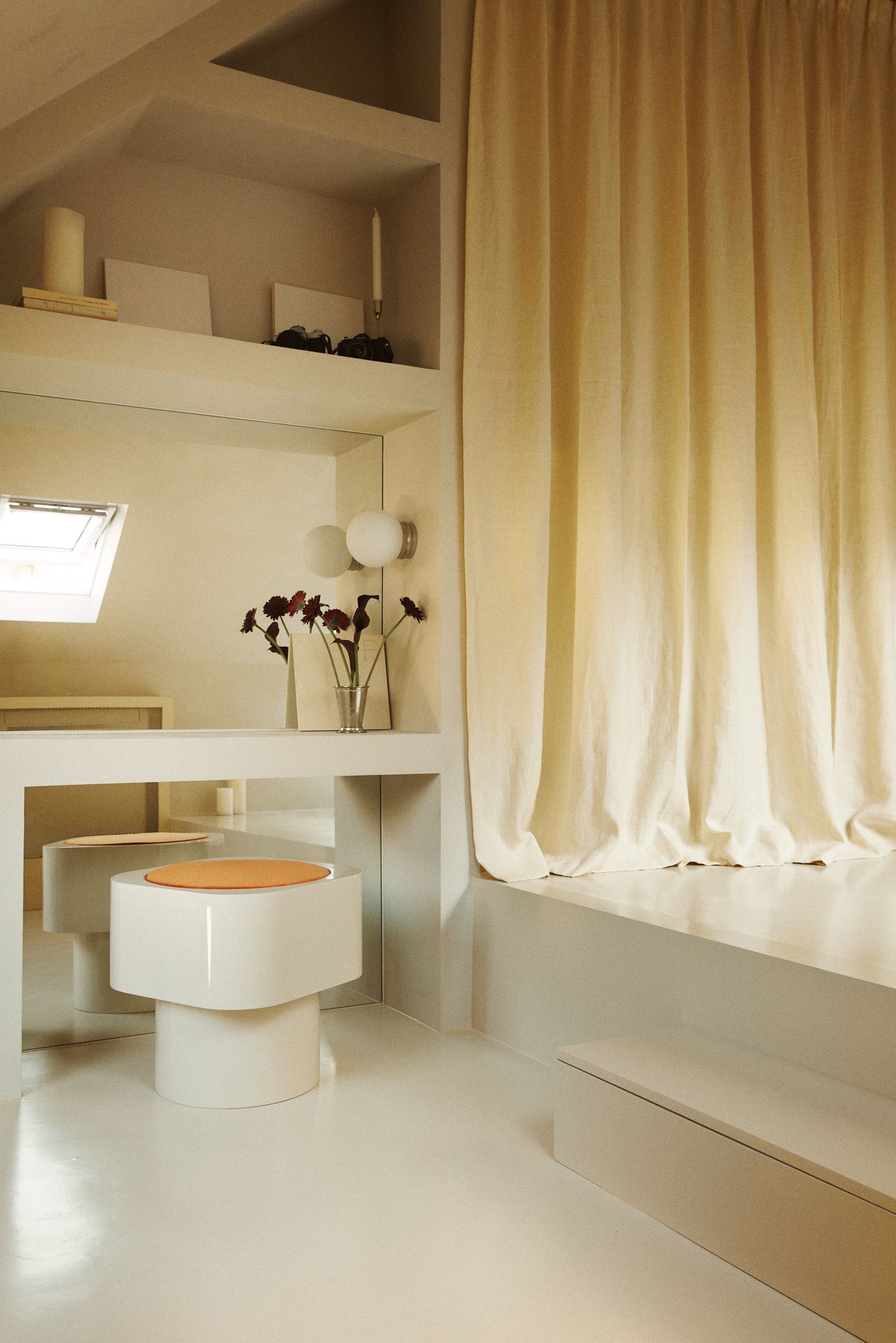
In the bedroom, the designers constructed a delicate atmosphere. The matte materials, the paint on the floor, and the dressing table share the same soft hues—the monochromatic effect creates a small, relaxed cocoon wherein the platformed bed becomes the centerpiece. The dressing area can be closed off by a curtain, such that the rest of the room can be devoted to resting and daydreaming.
Lighting tips and tricks
Despite its location—tucked in the attic of its building—the unit is filled with natural light, pouring in through four skylights and two windows. It’s a rare luxury in a 323-square-foot apartment, as Gérard and Lefebvre point out. Indeed, getting the lighting right was a priority, achieved with stainless steel, mirrors, and reflective surfaces like the garnet ceramic tiles in the bathroom. (The tiles are also a nod to one of the building’s charming red entrance doors.) A mirror was added behind a work area, a clever trick to enlarge the space and make the home even brighter. A glimpse of the artist/owner can be seen against the edgy finish where she posed, boots on, in the bathtub.
This 323-square-foot Paris apartment was originally published in AD France.


